Snapbar Branding Expansion
The goal for this project was to take the current Snapbar brand and to build it out to allow for stronger visual hierarchy, specifically for the website and marketing material, and a more exciting and fun brand aesthetic.
Project Length: 2 months
Snapbar
Branding, icon design, web design

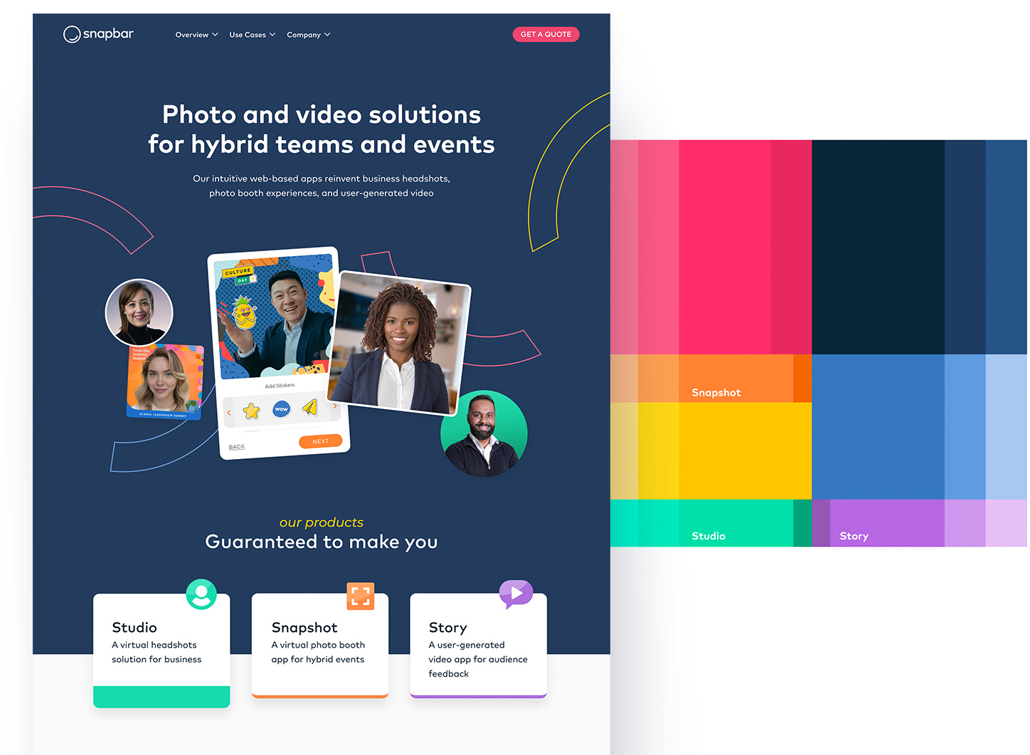
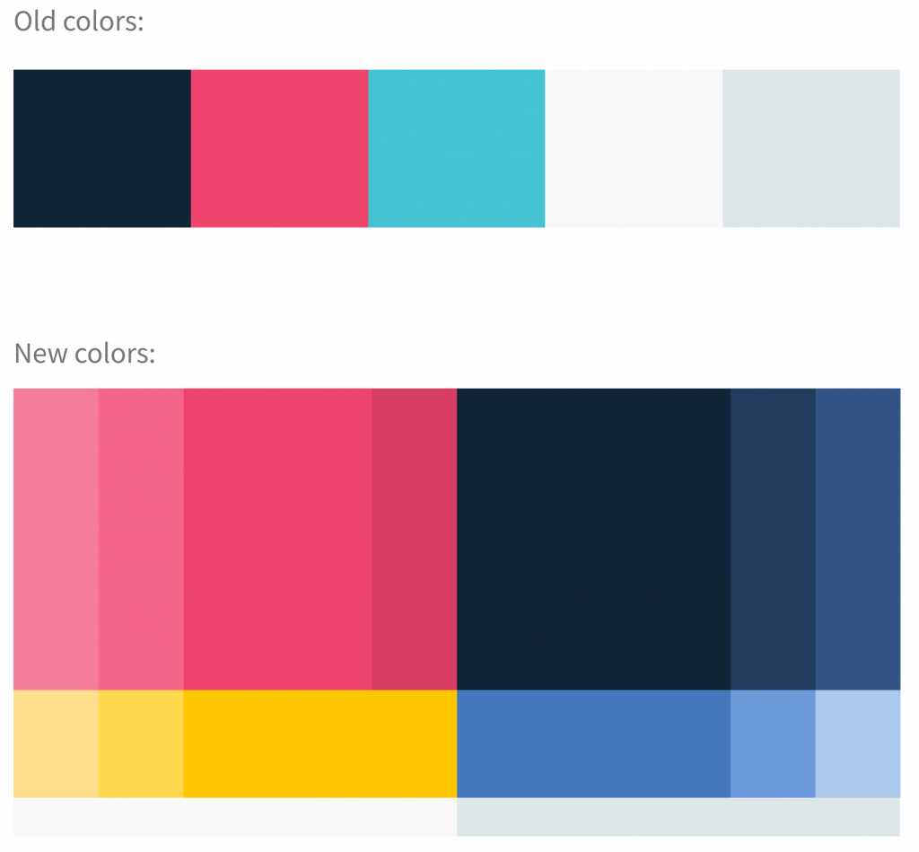
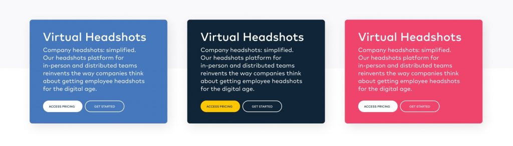
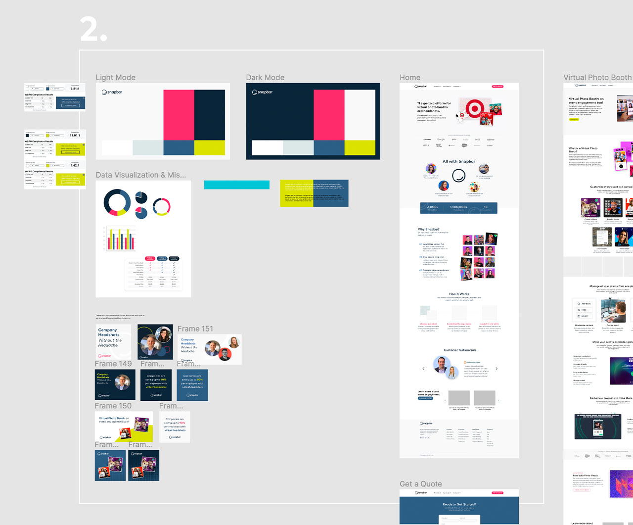
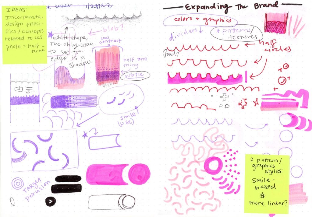
One main problem that the Snapbar design team was facing was that the marketing material, website, and informational content all looked way too similar. The old color palette was limited in how it could be applied and was causing the designs to be a bit boring and not as effective.
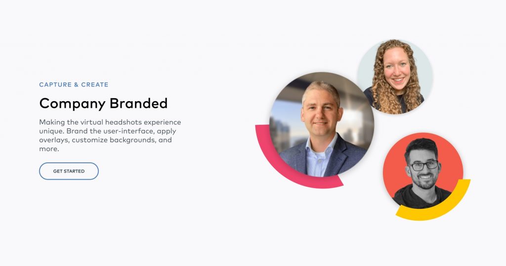
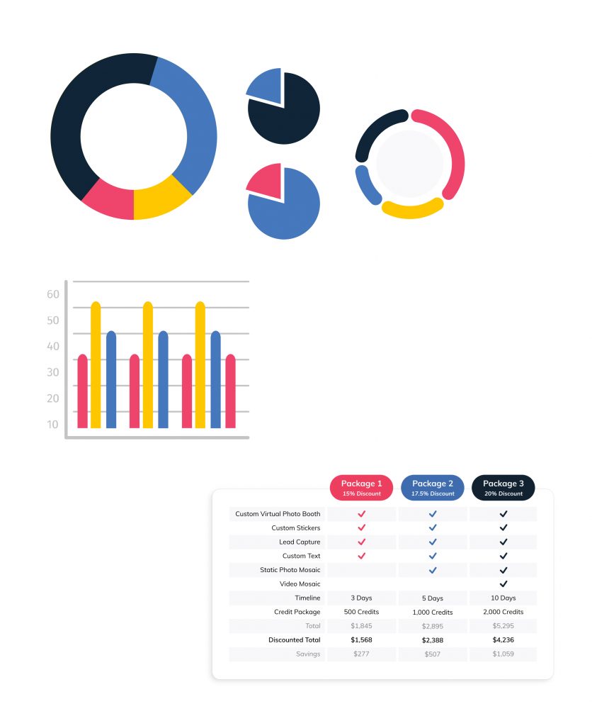
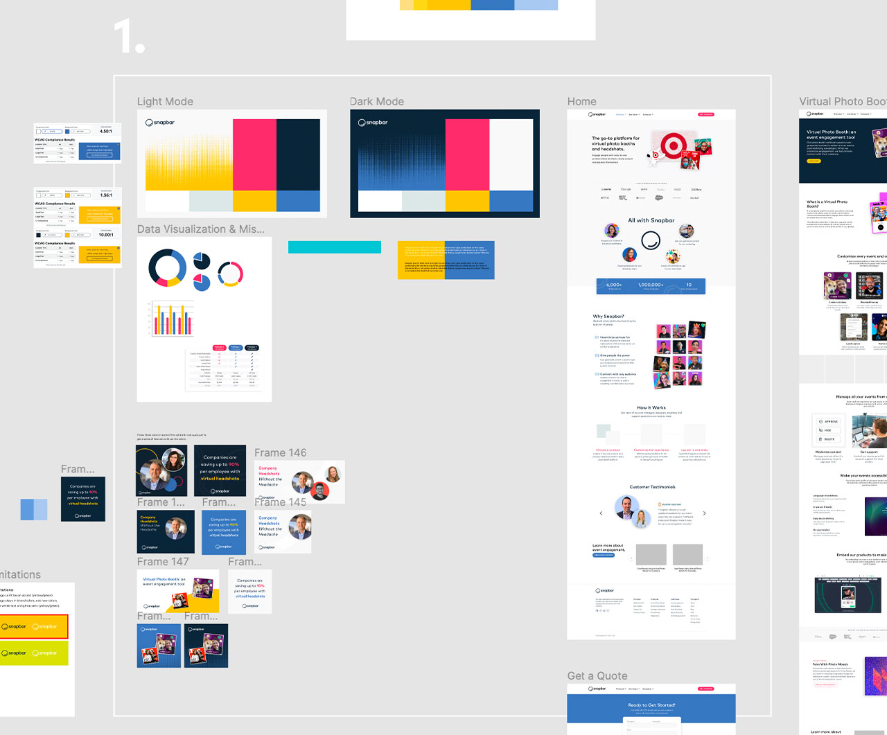
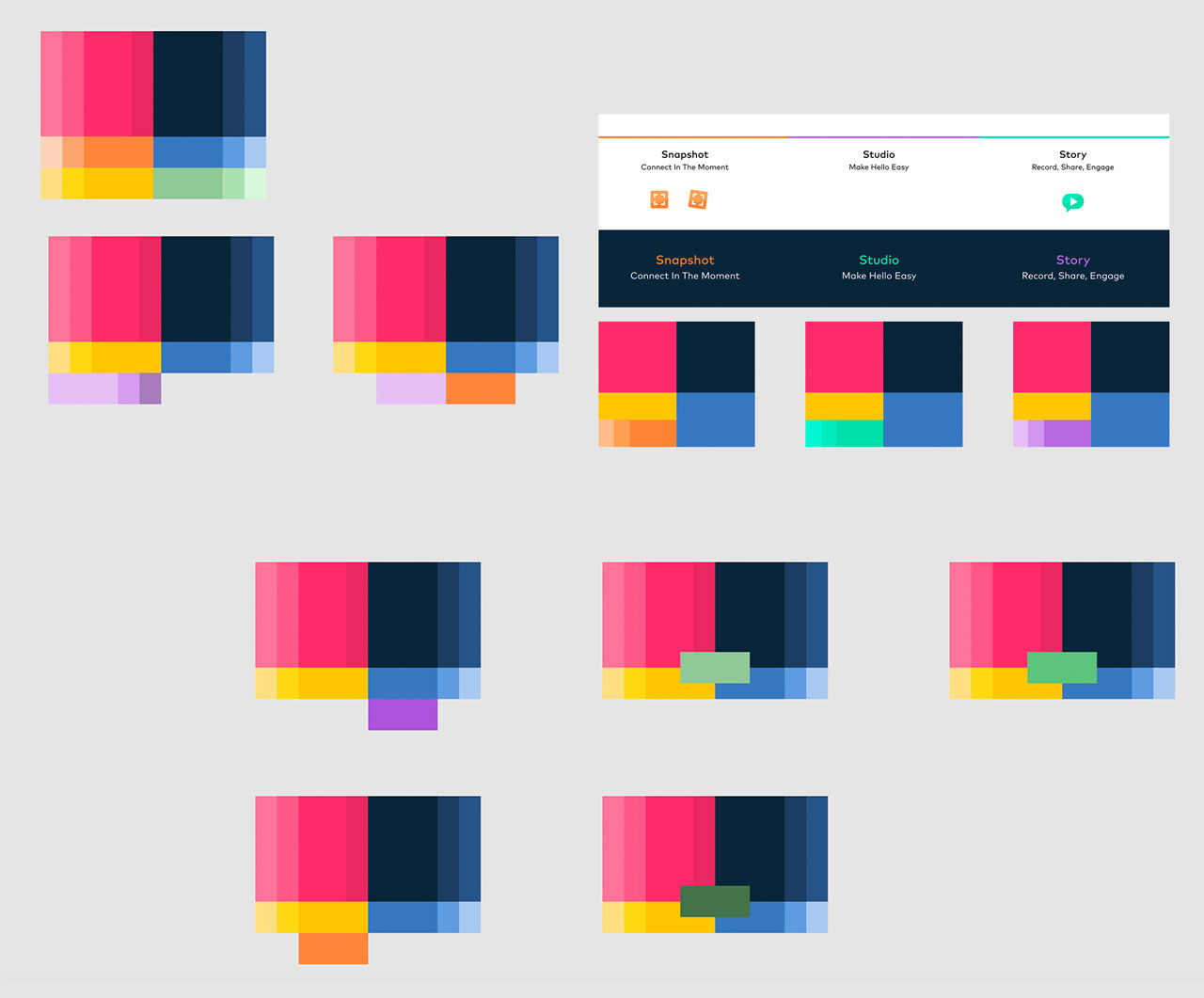
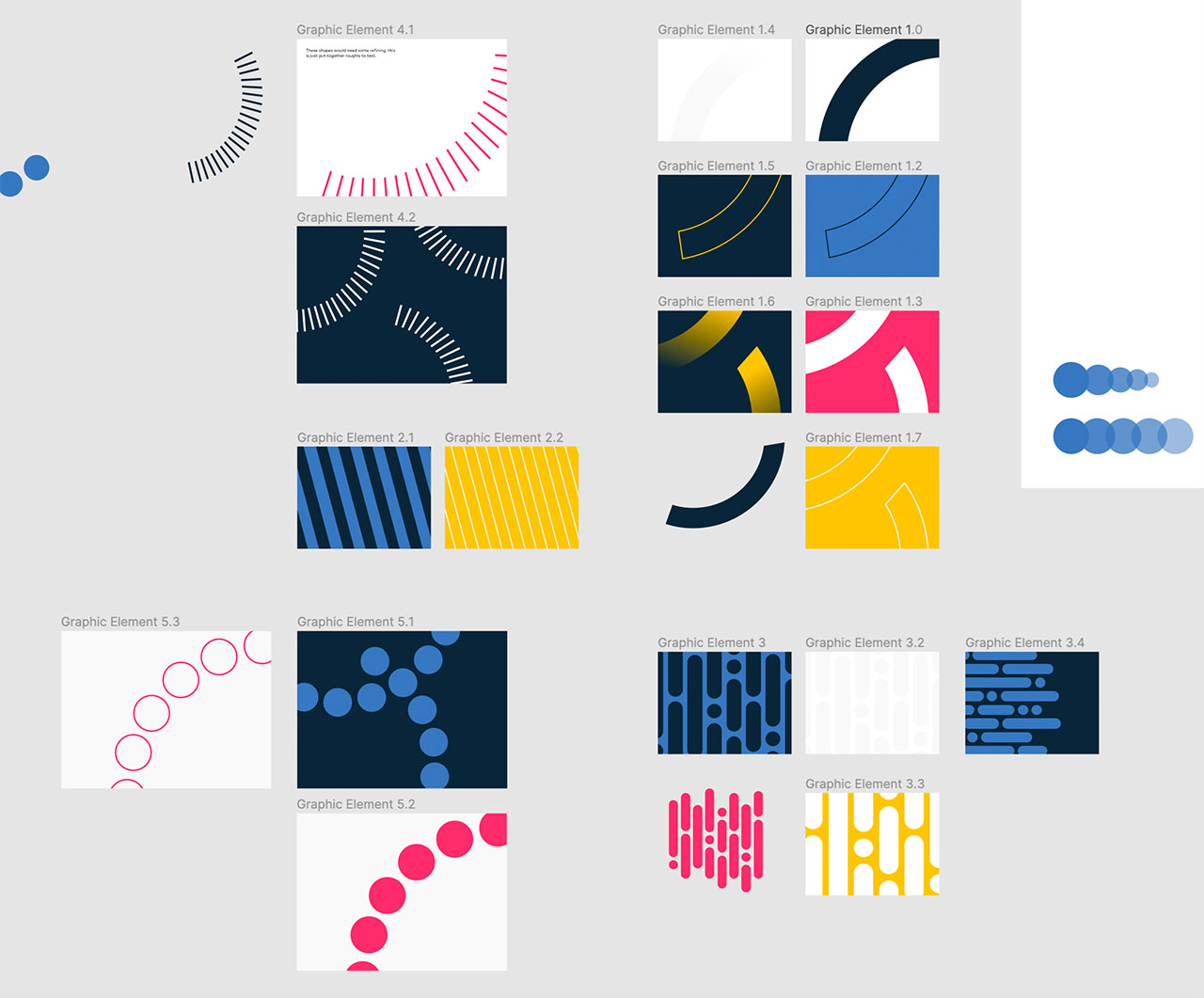
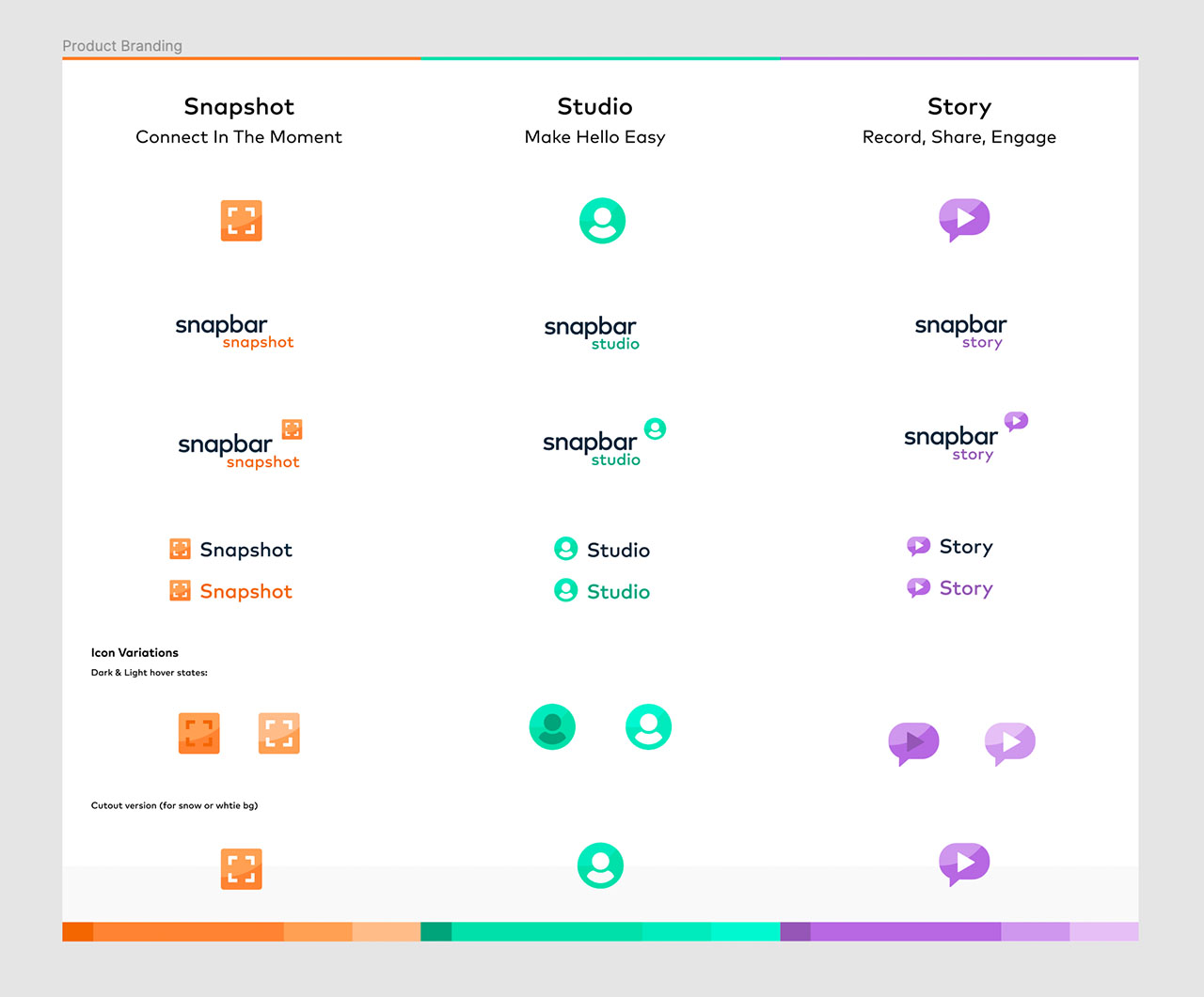
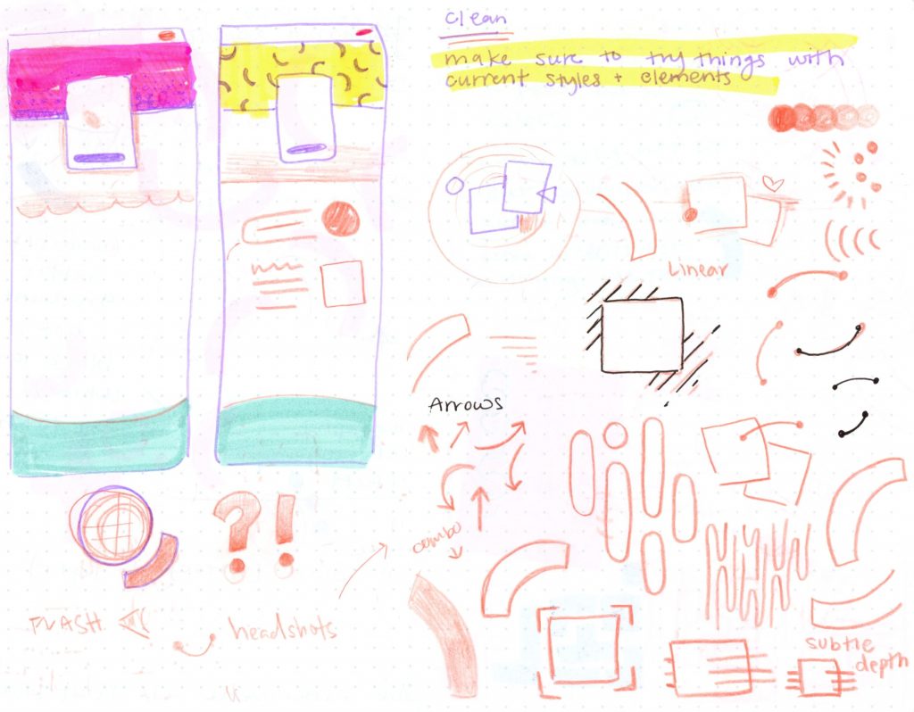
To expand the brand I reevaluated and filled out the color palette, branded 3 main products with unique colors and icons, and created a couple of fun shapes and patterns.


The new blue and yellow introduced into the color palette were specifically chosen to compliment the current brand colors and to create more color-triggered hierarchy.


Product Branding
Each product has its’ own accent color, icon, and wordmark. The accent colors were designed to be used in small areas associated with the corresponding product visible through all client touch points.


Take a little look into my process:
Work done in Figma


Whenever I got stuck on direction, I pulled out a sketchbook and scribbled for a while until I had new ideas to work with.

