Seattle Children's Hospital Icons & Infographics

Redesign print material for Seattle Children’s Hospital fundraising to match the updated Seattle Children’s branding.

Client: Seattle Children’s Hospital
Project Length: 8 weeks
Student Project
Icon design, page layout, information design

Goal: Design print materials to match the updated Seattle Children’s Hospital branding and clarify the structure of the content, making the materials more effective.

Output: Icon set, Facts and Stats trifold, trifold mailer with hero story and donation call to action.

Icon Designs:

Icon Process:

The inspiration for the icons came from the Seattle Children’s Hospital logo and brand guidelines. The logo includes rounded corners, white details, and strong symmetry, so those were elements that were incorporated into the new icons.

Mailer Process:

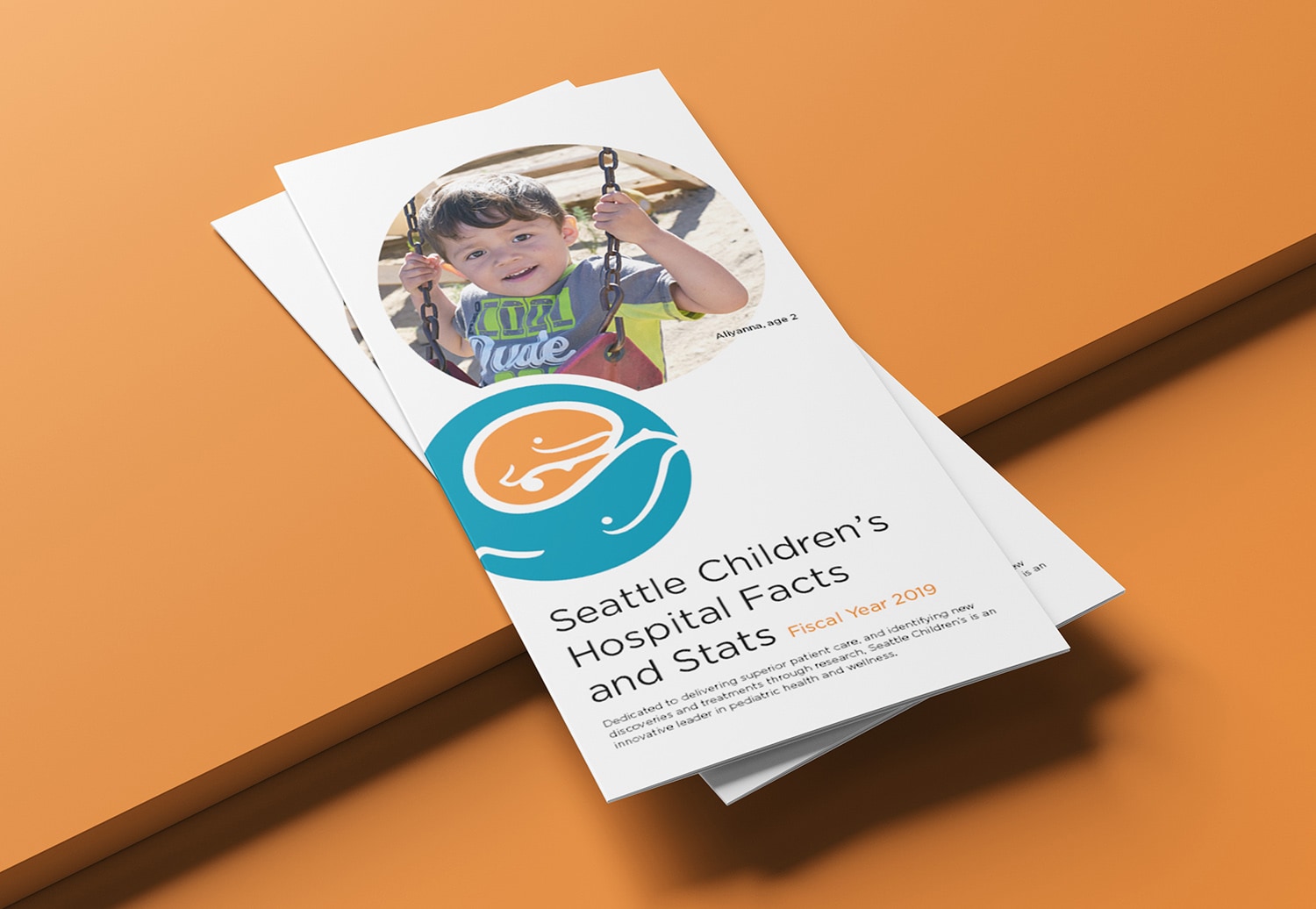
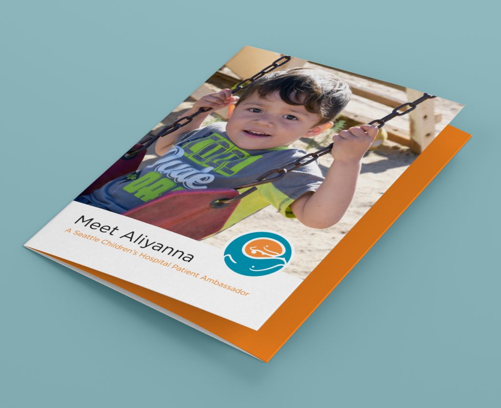
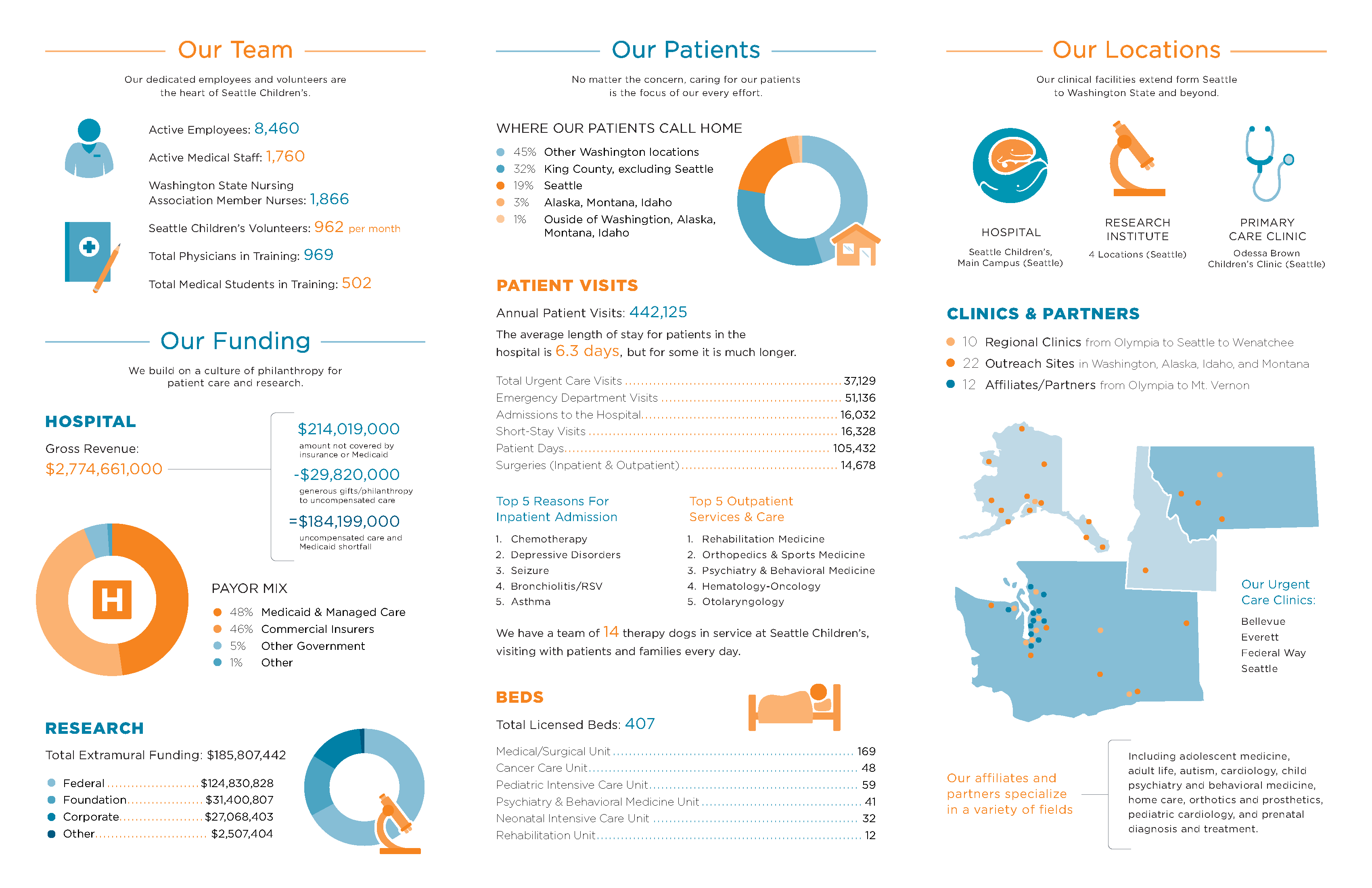
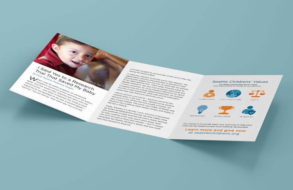
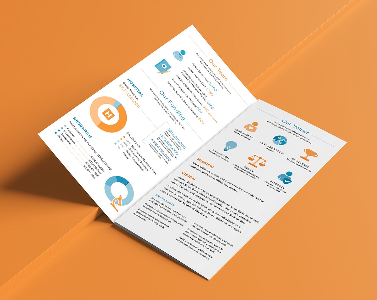
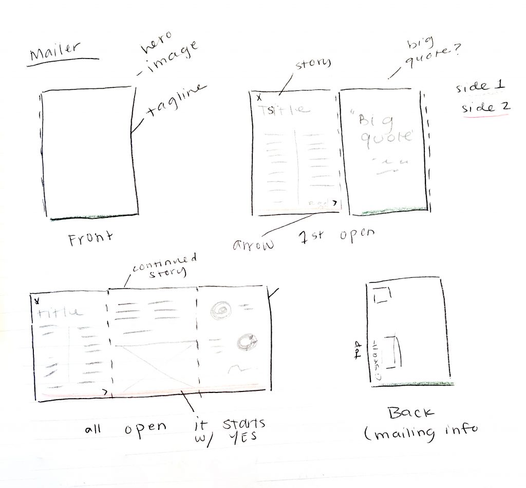
The mailer design includes room for a couple of images, some text, a quote, and a small infographic section about the hospital. 

The idea behind this design is to create something that could be reused multiple times for the stories of different children and highlight different aspects of the hospital.